user experience
health cost estimator
IMAGINE IF HEALTHCARE COSTS WERE AS EASY TO UNDERSTAND AS ANYTHING ELSE YOU BUY...
Quick – How much would it cost you out of pocket if you were rushed to the hospital right now?
You're not the only one who doesn't know; your doctor doesn't either. Can you think of anything else that you spend thousands of dollars on without knowing the cost before you buy it?
When Parasail set out to simplify the health care system for patients and doctors we conducted consumer research to stack-rank health care's biggest headaches... and this lack of transparency into price – and even understanding how insurance costs were calculated – rose to the top...
Human-Centered Design - Applications:
At the root of all product and marketing executions is a deep empathy for the end consumer...
Here's a detailed look at the process behind the experience.
Using Interaction Design to lead users through complex concepts
UX/UI Design

2 - Confirms data from insurance card (manual edit)
Data input from picture of insurance card and OCR can be verified and manually edited by the user
This is the same screen a user would see if they'd chosen to manually enter their insurance info

1 - User opens app
A brand-forward splash screen (user likely enters from an email invitation from the doctors office or through a Parasail landing page or banner ad)
User is prompted to scan their insurance card to capture most of the form info needed
A manual entry field is also provided
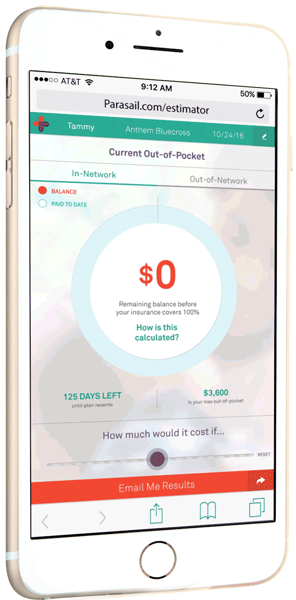
3 - User's current unpaid OOP Max is shown
Showing the patient name, plan and date creates credibility that the estimate is accurate. It also lets the user switch family members easily.
The goal of the app is to create the "OH SHIT moment" which is a catalyst for researching a payment plan...
So the app highlights the patient's current unpaid deductible and co-insurance to show what their potential exposure is before insurance covers 100% of remaining costs
The user can switch to Estimator Mode with a large toggle always visible at bottom
Our primary CTA (email capture) is also always visible from any screen.
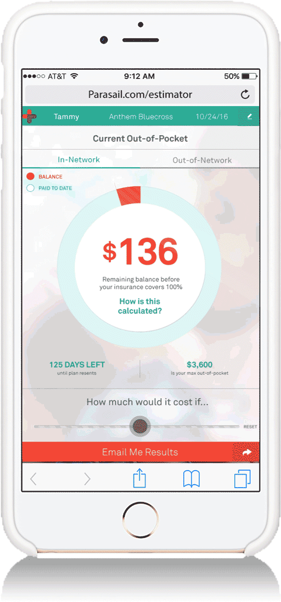
4 - User taps large circle graph to get cost details
Without a written cue, we hypothesized that the user would instinctively tap the large circle graph with the big red number, which would animate into a breakdown of their costs and plan
This high-level info-graphic shows in a simple animation how the user's plan is part of a larger family plan – and also shows how their exposure was calculated
A small question mark prompts the user to tap on the bars for even more detail
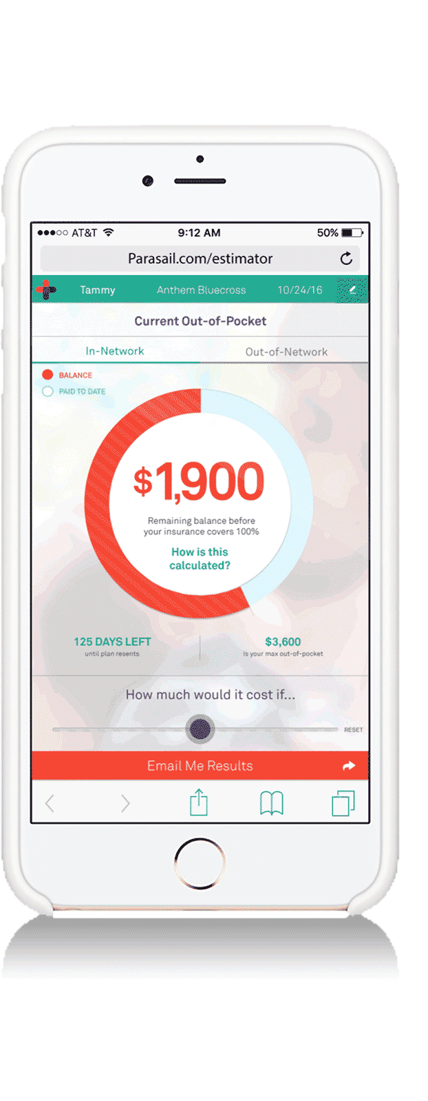
5 - User taps bar which explains each component
If a user taps on any segment of the bar chart a "What's This" fly-out appears at the top with an overview of how insurance plans are structured. The user exits by tapping the "X" at the upper right
Additionally, the selected bar segment remains highlighted while the rest of the chart fades - and a short description appears
Although shown as an animation here, the user only sees one segment at a time but can scroll horizontally through each segment explanation


6 - User enters Estimator Mode
From the main screen, the User enters Estimator Mode by moving the slider at the bottom labelled "How much would it cost if..."
The contrast color, opening message and header at top of page make certain that the user is aware that this is hypothetical and not actual
As the user moves left to right, the components that make up their insurance shift as the total dollars owed increases or decreases.
Costs are estimated using plain-language health issues (from "Ankle Sprain" through "Heart Attack")
7 - Estimator Reset button
The user can also send their results to a spouse, doctor or anyone else they'd like
9 - App captures email - Share?
After capturing their email, the CTA prompts them to share the app via social media or email
From an part of the estimator the user is prompted to email the results or share
8 - User taps "Email Me Results"


Developed using design-thinking and agile sprints with a remote team
DEVELOPMENT PROCESS:

Step 1: Consumer Insights, Requirements & User Journey Map
General Population Survey - 96% Accuracy
There's no point in trying to find product-market fit if you don't talk to the people you're trying to serve... which is why the first step of any product roadmap, marketing strategy or brand positioning is aligning with the consumer on their unmet needs.
So I wrote and launched a survey to inform our product strategy and roadmap priorities.
Use Cases, User Stories & Journey Map
After defining 5 user profiles for the Estimator product, I mapped an ideal user flow with MVP, P1 & P2 features... and flowcharted how the new product would fit within a first customer (hospital) API integration.
Then the VP Engineering, VP partnerships, our lead designer and product manager got together to optimize it and make a plan to execute.

Other pain-points
The survey revealed several patient pain-points which we later rolled into other products.

Sell the Vision to all Stakeholders
An often neglected step, it's important to paint a picture for everyone – investors, team leaders, executives, developers and partners – to get aligned as well as excited about the product. If everyone's not sold on it - and agrees what it is - it's easy for projects to go off the rails or get permanently side-barred.
Directional Wireframe Sketches Kickstart Thinking
I like to do some quick wireframe and information graphics sketches for complex communications to help kickstart the design team on what needs to be communicated, how the information nests together and what the hierarchy of importance is... I've found when combined with a clear brief, it helps designers move rapidly through early conceptual road-blocks.
Step 2: Requirements, Briefing, Wireframes
Full Wireframes & Info Hierarchy
From my product brief and rough wireframes, the design lead, PM and I collaborated on a more in-depth wireframe capturing the full scope of information architecture.
Content Nesting & UX Direction
I created information flow/ interactivity sketches to help the design team understand the mechanics of insurance and the hierarchy of the UX.
Navigation/Interactivity Direction
To help the design team get a clear picture of how the UX would unpack the information, I also provided a sample sketch of how interactivity might work in the app.


Step 3: UX / UI Concept Exploration

Conclusion
The big, single "current exposure" number and chart was a good start. We also liked the use of color to signal financial risk.
But overall it seemed too complicated with too much information at the top level where users don't need it yet.
Concept Approach A
Based most closely on what was in our vision pitch deck and in the information/interaction sketches, this direction attempted to create simple visualizations of the components that make up insurance but kept each of them separate.


Concept Approach B
With a more clear information hierarchy, this more branded approach clearly highlights the total patient exposure (producing sticker shock) and the solution (an estimated affordable monthly payment).


Conclusion
The clear communication hierarchy and high-level problem:solution with actionable CTAs worked well (as did the high contrast design).
Secondary information that explains how insurance works and how costs were calculated was still too complicated though.

Conclusion
The entry point of the Home page and strict adherance to the wireframes is good for an MVP thought process – but the information comes across as too dense and complicated (like a medical bill itself) to be the design approach we were looking for.
Concept Approach C
The closest to the actual wireframes, this no-nonsense flat hierarchy (and flat design style) UX uses mostly text with minimal graphic support to walk users through their exposure and how it was calculated in a logical progression.


Concept Approach D
Similar to Approach C in its adherance to the wireframes and copy-driven UX, this direction highlights the key exposure number more and nests the secondary information into expandable modules (with more clear graphics explaining how costs are calculated).


Conclusion
The nesting of the calculation information into a deeper module layer helped clean this up - and the info-graphics were easier to understand. Ultimately though, we were looking for a more visually impactful UX where the costs hit the user at a visceral level and the breakdown was understandable in a quick visual.

Conclusion
For the most part we felt this UX/UI had too flat of a hierarchy and required too much in-depth reading to clearly understand.
However, the highlighted and CTA driven payment plan, locked up with the total exposure was good to keep in mind for stronger conversions.
Concept Approach E
Less branded than other approaches, this nonetheless felt like a stand-alone app. With a text-driven UX/UI that mirrored the wireframes almost exactly, it's most interactive feature was the ability to toggle between highlighted payment plan options; more of a hard-sell than an info piece.


Concept Approach F
This approach followed the interactivity sketches closely while making sure to cover all content from the wireframes. Using animation to help show how the components of insurance nested together in an insurance plan, it also made novel use of shifting background color to show when you were in estimator mode.


Conclusion
This visual and interactive approach to communicating total cost and explaining insurance components was what we were looking for... and the background color shift to clearly communicate when the user was looking at hypothetical information worked well.
This was the direction chosen, but we incorporated some of the learnings from the other approaches into a user testing mockup...
Step 3: User Testing & Technical Specs for Developers
Using InVision & UserTesting.com we tested and optimized variations of the screens above